

Bitcoin: Where could BTC price go in 2021?
Bitcoin: Where could BTC price go in 2021?
On-chain analysis

Hello Readers!
Firstly, apologies for not being able to write the letter since the last few weekends as I was taking some time off trading to avoid the market chops the last couple of weeks after BTC hit 42K. But now, we are back to a trending market and the bullrun has most likely resumed. So, let’s get back to action!! Subscribe to this newsletter to get the weekly update in your inbox..
So what’s happening with BTC right now?
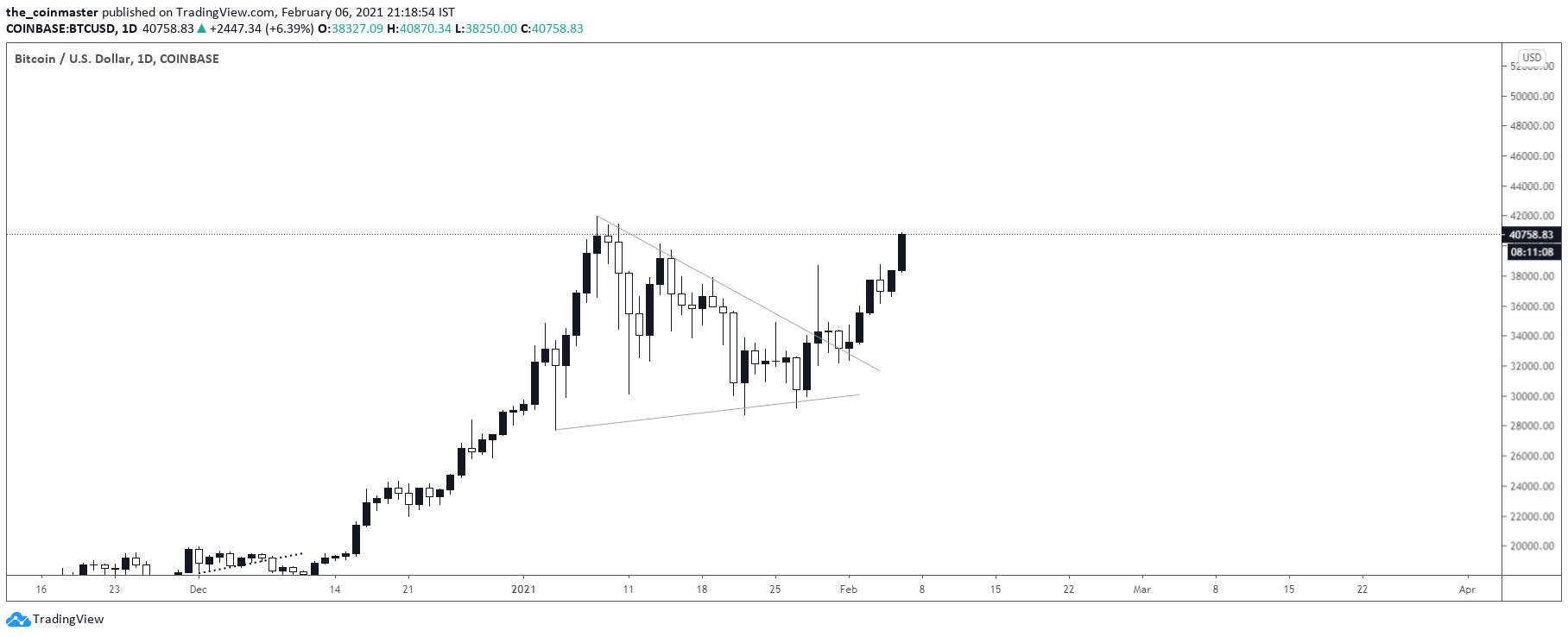
We just had our first major correction (30% drawdown) in this bullrun. After hitting 42K, BTC ranged inside an HTF triangle for almost 4 weeks. But now, we have broken out of this triangle and back into parabolic action. So where could be the top of this run? And when can we expect the run to top out? To answer these questions, lets dive deeper into the analysis.
Comparing 2021 Bullrun with 2017 and 2013
In order to understand where the next BTC top could be, we can compare the price action to the previous two major bullruns- 1) The 2017 run which topped out around 20K ; 2) 2013 run which had a double top, first at 283$ and then again at 1100$. My analysis methodology will be first to understand whether we are closely following the 2017 run or this current bullrun resembles 2013. Once we can determine with a fair degree of confidence if we are following 2013 run or 2017, we will try to project the price action and estimate an approximate top and also try to determine the timing of this top. While a lot could change over the weeks, the idea here is to make an educated guess of what could happen over the next couple of weeks.
To begin the analysis, the first metric which I would use is an On-chain metric: UTXO counts
UTXO counts are one of the major determiners of HODLing behaviour of the investors. UTXO stands for Unspent transaction outputs. There are plenty of resources available if you want to understand this metric in more details. However to keep things simple here, UTXO counts are one of the major determiners of HODLing behaviour of the investors. If UTXO counts keep rising, it usually means people are HODLing rather than spending or selling their bitcoins. During a bullrun, the UTXOs in general would rise, but we can try to break it down further to check if anything peculiar is happening in 2021 which could be similar to what happened in 2013 or 2017.
UTXO trend of 2021 Bullrun

If you look closely at the above chart, you could see how the UTXOs have been constantly increasing, even during the price dips. During the recent dip from 42K (30% drawdown), UTXOs actually rose instead of falling, which means, current investors are HODLing strong even when there is a dip in price
UTXO trend of 2017 Bullrun

Now lets compare the UTXO trend during the 2017 bullrun. One look at the above chart will make it pretty clear that the UTXOs were falling during price dips, meaning HODLing wasn’t as strong as in 2021. There were more weak hands and the investor confidence wasn’t as high as in 2021.
UTXO trend of 2013 Bullrun

Do you see it now? During the 2013 bullrun, UTXOs showed similar trend to what is happening now in 2021. Even during major price dips, UTXOs kept on increasing, thus signaling similar HODLing action was taking place in 2013 as is currently happening in 2021
Since HODLing behaviour is one of the major characteristics of a bullrun, it would be safe to assume that 2021 is more closely following 2013 bullrun rather than the one in 2017.
Now, lets use another on-chain metric for comparison: MVRV ratio to revalidate our assumption that 2021 bullrun is similar to 2013.
MVRV stands for Market Value to Realized Value. While market value is the price of bitcoin at any given day, realized value is the average price at which investors have bought their bitcoins. This ratio is one of the widely used metrics to value the network and is a good proxy to understand whether BTC is overpriced. A high MVRV usually means the asset is overvalued.
Lets try to compare the MVRV ratios of 2013 and 2021.


The first chart is the comparison of MVRV ratio for the 2013 bullrun and the second one has the MVRV ratios for the 2021 bullrun.
If you look closely at both the charts, 2013 Bullrun began around 14th Feb’2012 when price dipped to 4$. MVRV ratio back then was 0.8. As we all know, the current bullrun began around 10th March’2020 when price dipped to 4K$ during the infamous “Corona crash”. The MVRV ratio was 0.7. The slightly lower MVRV in 2021 as compared to 2013 could be attributed to the corona hysteria around the March dump which led to slightly larger drawdown than warranted.
2013 parabolic run started around 27th October’2013. Price was 11$ and MVRV ratio was 1.47. 2021 parabolic run started around 6th October’ 2020. Price was 11K$ and MVRV was 1.48. Do you see the pattern now?
2021 bullrun has been strikingly similar to 2013 in both UTXOs and MVRV trends. Also, the prices in 2021 is a close factor of 1000 when compared to 2013. 2021 bottom was a factor of 1000 of 2013, so could the top be a factor of 1000 too? This leaves us with the price peak of 283K for 2021. But note that 2013 did a double peak: one at 283$ and then another at 1.1K$. So where does that leave us for 2021?
Lets try to understand that by superimposing the price action chart of 2013 on the current chart for 2021.

The above chart is a superimposition of the 2013 bullrun on the current bullrun. As per this chart, the top of the 2021 bullrun is around 220K$. While the actual top could be different from this approximation, one thing to note is the timing of the top. While many experts were expecting the top to be around December, this analysis clearly suggests that the top could be coming much earlier than expected. While we need to closely track if price actually follows this trend, but if it follows to a fair extent we might top around April to May timeframe.
The analysis is not over yet. One more thing to note in the 2013 run was that there was a double top. One in April and another in December. So when could we expect the second and the final top of this bullrun?

If we stretch the projection of the 2013 price action on 2021 bullrun, we get the above chart. The first top of the 2021 Bullrun could be at 220k$ in March’2021 and the second one at around 1 Million $ in July’2022. There will be a long period of consolidation in between where price will keep on ranging between 50K$ to 100K$. This could be a major difference from what was being said by the so-called “experts”. This could mean a million dollar bitcoin could come sooner than expected. This wild idea could be very close to reality with the amount of interest being built up among institutions for considering BTC as a reserve asset to get mouth watering yields in this present era of low and negative yielding interest rates. With the broad money supply increasing and more QE and economic stimulus, all these could just serve as fodder to this burgeoning mammoth called Bitcoin.
Please consider this analysis for educational purposes only and not for any financial advise. Leave a like and comment in case you liked this analysis. Also please subscribe to this newsletter if you haven’t already. Thanks for reading.
Yours truly
Coinmaster
Am new to crypto, tks 🇸🇬
Thx for sharing